Color in marketing: what is the color of your brand?

There's loads and loads of literature on the effect that colors have on us. Unfortunately, not much in there has any scientific background. I've decided to only include information that was backed by scientific research. All papers used are listed at the end of the post.
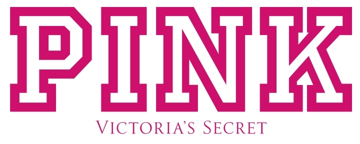
So, we know the following: color is a powerful thing (no surprise here). Colors affect us and our perception of products, they affect our decision-making process, increase and decrease buying intent. With time, we learn to associate colors with brands: the combination of yellow and red becomes McDonald's, pink stripes become Victoria’s Secret.
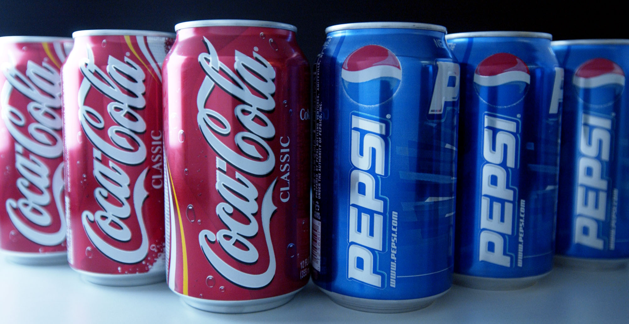
Colors help us disassociate competitor brands: imagine how much harder it would be to see the difference between Coke and Pepsi if they used the same color scheme.
In short, colors trigger emotional associations and make up the brand’s personality in the eyes and memory of a customer. How does this happen?
The color of a brand logo activates related color associations (e.g., reliable, intelligent, corporate), which contribute to the perception of a brand’s personality (e.g., competent).
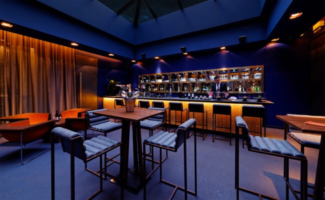
And this is why it’s important for us to know which colors trigger which associations. Using the right ones, your brand will convey the values you want to convey, have a fitting image, and evoke the right kind of emotions and behavior. For example, blue walls in a restaurant will add to a relaxing atmosphere and encourage people to linger longer and, therefore, order more, while red walls in a fast food restaurant will signal excitement and rush, nudging visitors to buy more and do it quicker.
These are the kind of connections the studies have explored in recent years. Moreover, different studies showed that colors also affect consumer perceptions of advertising, alter perceived website loading time, and affect product category membership, among other factors.
Colors and emotions (with marketing applications)
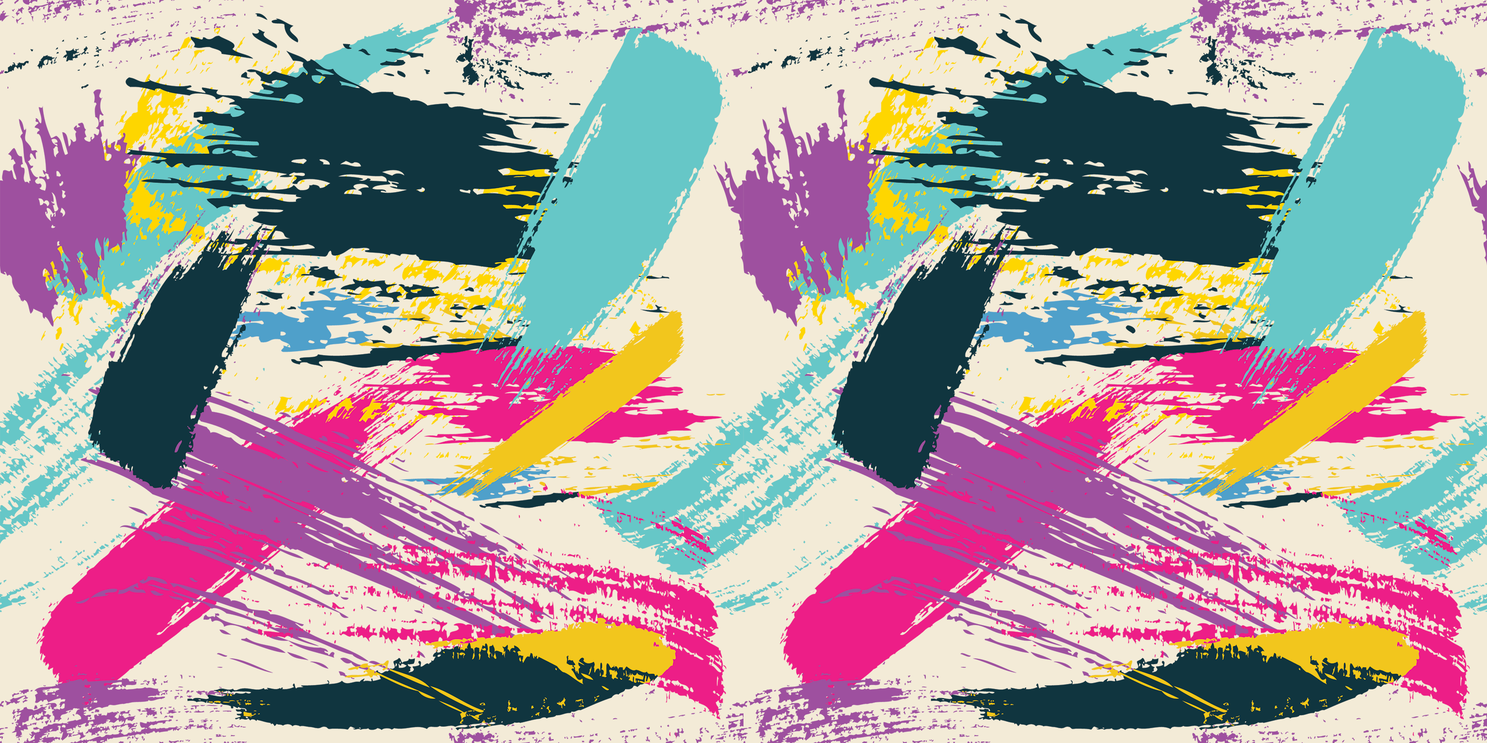
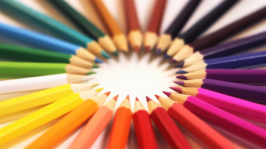
Despite the fact that color perception depends on numerous psychological, cultural, and demographic factors, there are still common associations that remain rather consistent across studies. Here they are:
How to signal that your brand is trustworthy:
White

White is linked to sincerity as it is associated with purity, cleanness, simplicity, hygiene, clarity, and peace. It can be also associated with happiness according to one study.
Yellow
![]()
![]()
Generally evokes feelings of optimism, extraversion, and friendliness, and can elicit happiness and cheerfulness.
Pink
Pink is linked to the dimensions of sincerity as it is considered nurturing, warm, and soft.
To add perceived sincerity to a brand, use white, yellow, and pink.
How to signal that your brand brings joy:
Red
Red is considered an arousing, exciting, and stimulating color. It evokes excitement and is generally associated with activity, strength, and stimulation.
It’s important to note that generally longer wavelength hues (e.g., red, orange, yellow) induce states of arousal and excitement.
Orange
Orange, therefore, is also arousing and exciting, although it is less so than red, and it is considered lively, energetic, extroverted, and sociable.
As you might recall, yellow also signals cheerfulness and excitement.
To add perceived excitement to a brand, use red, orange, and yellow.
How to signal that your brand is competent and reliable:
Blue

Blue is associated with intelligence, communication, trust, efficiency, duty, and logic, and is often seen as a secure color.
Brown

Likewise, brown is a color that is related to seriousness, reliability, and support.
Green
![]()
![]()
Green’s primary association with nature creates feelings of security and connection with the outdoors.
To add perceived competence to a brand, use blue, brown, and green.
How to signal your brand is sophisticated:
Black
Black used to be associated with negative emotions, but it came to stand for sophistication and glamour. It signals power, stateliness, and dignity. It takes us to the world of fashion where black expresses status, elegance, richness. We recall black tie events, suits, and black dresses.
Purple
Purple also calls for luxury, authenticity, and quality. It’s seen as a dignified and stately color - perhaps because it used to be reserved for royalty and to show social roles. It’s also considered a “feminine” color.
As you might recall, pink is also associated with softness and femininity and can also signal sophistication for many people.
To add perceived sophistication to a brand, use black, purple, and pink.
An overwhelming number of logos contain three main colors: red, blue, and black.
A study examined how people perceive these logos and showed that indeed there was a significant increase in perceived excitement between the color (red) version and the grayscale version, a significant increase in perceived competence for the color (blue) version compared with the grayscale version, and significant increase in perceived sophistication for the color (black) version compared with the greyscale version.
People also liked the logos more compared to the greyscale version if they were in blue or black, but not in red.
Colors and gender/age
According to some research, genders perceive colors differently. Men are more tolerant of gray, white or black than women, while women react to the combinations of red and blue more frequently.
For adults, the combination of red and blue was the most preferred one.
Beyond colors
Simply connecting the color association and the preferred image of the brand isn't enough.
First, it’s important to take into account the specifics of the brand. Your product might have a color association that’s different from the common association people have with colors.
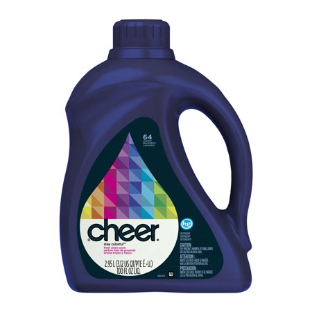
For example, Procter and Gamble, the manufacturer of “Cheer” detergent, tested the colors of the “flecks” in the detergent. P&G tested three different color flecks: red, blue and yellow. Consumer Reports stated that people complained that detergent with yellow flecks didn’t clean clothes enough, red flecks damaged their clothes and blue flecks made clothes cleaner. Naturally, the company went with the blue flecks and “Cheer” detergent became one of the longest-lived brands in the market.
Second, colors are complicated: they include saturation, brightness, transparency... It will take a designer to do things right in a psychological way as well as in an aesthetical one. Research exists that even argues that "color energy is principally determined by saturation level: highly saturated warm colors carry more aesthetic energy than do de-saturated cold colors”. While you could have an idea of a color for your logo, it will take a professional to do it right.
Third, there's a lot of theory on how colors combine to look better together that's worth keeping in mind.
Conclusion:
We know that there's a relationship between color and brand personality, and it's important to take advantage of that - even if the whole field of color psychology is more nuanced and requires testing and deeper research.
Papers used: