How to get branding on social media right (according to science)


This blog post is about branding. Branding is the way you communicate the values and characteristics of your company to the public. Social media is an extremely important part of that communication, and a lot in your profile and the way you manage your page tells the audience what kind of a business yours is. Everything has its effect: the colour and the font of your logo, the profile image of your CEO, the images that go with your updates and company news, and, of course, your content and the way you interact with your audience. We'll go through each of these to tell you what you might be telling your audience without being aware of it.
1. Your logo
There is a high probability you've spent more time coming up with your logo than making your business plan template. And for a good reason: everyone one knows logos are important. However, there are so many myths, opinions, and proper research surrounding the logos that at some point the whole topic became rather confusing. I've gathered the main points that will help your decide if your logo represents your brand in the way you want it to be represented. We'll start with color, as this is the most discussed topic on the matter.
Color
![]()
![]()
Favorable colors
According to the research done by Sliburytea and Skeryteb (2014), the favorable color of the consumers does not depend on their age or education. It does, however, depend to some extent on the consumer's gender. In their study, female respondents indicated white, blue and green as their favorite color much more frequently, while the men preferred red more often than women.
Common associations
It is widely believed that colors bring out particular emotions in people. This might not be exactly correct, but research does show that people associate colors with particular emotions. These associations aren't universal and depend heavily on the person's cultural background, but they exist: generally, calmness is found to be associated with blue, love with red, summer with yellow, nature with green, cleanliness with white, and elegance with black color. In terms of the quality and the price of the product, 36% of the responders associated gold color with luxury.
A study by Bottomley and Doyle (2006) showed that the relationship between brands and color hinges on the perceived appropriateness of the color being used for the particular brand. In other words, people favor the brand if they believe the color "fits" the product. For example, it fits WHOLE FOODS to be healthy and natural. It fits Apple to have a white/silver logo, because it represents their love for clean design. It absolutely wouldn't fit Claire's, a retailer of accessories and jewelry aimed toward girls and young women, to go with any serious and boring colors, so their logo looks like this: ![]()
![]()
Recognition, recall & conversion
So you've figured whether your logo appeals more to men or women, and whether the emotions it is supposed to evoke are enhanced by the logo's color. But maybe you want to appeal equally to men and women, and you don't particularly care for the emotions described above. If that's the case - don't worry, the point that's coming next is the most important one anyway. How do you make sure your logo is remembered? How do you increase conversion on your landing pages, sharing on social media, number of followers with colors? Research says the following: while consumers prefer color patterns with similar hues, they remember and converse better when there is a highly contrasting accent color. This means creating a visual structure of your logo, website, profile image or anything else consisting of base analogous colors and contrasting them with accent complementary (or tertiary) colors: 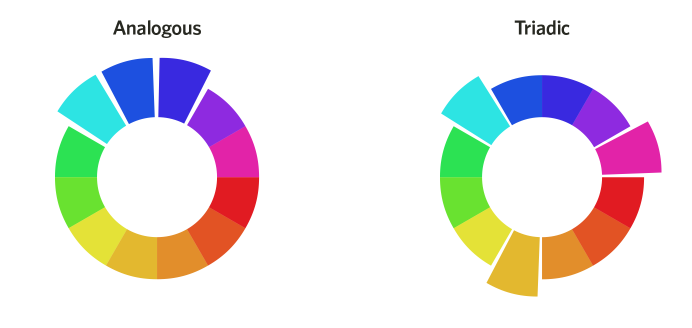
An example that is cited very often is this one: a boost in conversions due to a change in button color. 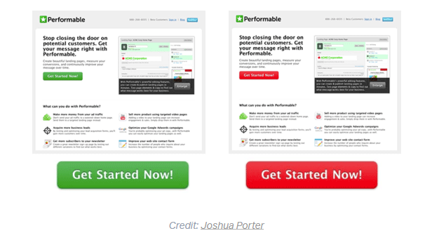
The button change to red boosted conversions by 21 percent. However, as a number of authors have pointed out by now, it doesn't mean that red generally converts better than green. Instead, red wins because it provides a starker visual contrast to its surroundings than green does. The reason for all of the above is a psychological principle known as the Isolation Effect. It states that if something stands out of its surroundings, it is more likely to be recognized and remembered. And, as it happens, more likely to drive actions as well.
Font
Fonts have their power. They were shown to affect your opinions and how long you will read the article for. They bring out different emotions. The example that is cited pretty often is this one: 
The font makes you feel the difference despite any context, and that is pretty amazing.
The basic idea of choosing your branding font is that it should fit what you're saying and the emotions you're saying it with. Stay away from unreadable fonts, no matter how pretty they are. And while we're on it, remember that the prettiest font should not be your goal. The appropriate one should be your goal. It should fit your brand's voice, style, and mood - much like with color.
2. Your profile image
Your social media profile is not necessarily the logo of your company. It can be your photo - maybe you're a freelancer building your personal brand. Or maybe you're making your brand as personal and approachable as possible. Or maybe you have both the brand page and the social media page of your CEO. The point here is this: you have to work on the profile image as well. Luckily, there has been tons of research that will help you achieve the perfect profile image.
What is considered perfect in this case? As an expert, business owner, marketer, or anyone similar (as opposed to a potential romantic partner), you most likely want to appear approachable, helpful, competent, and influential. What in your profile image signals that you are? Research has found that smiling is a key component to approachability: basically, the wider your smile is, the more approachable you are perceived.
For the rest, Guy Kawasaki, a very well-known social media expert, points out four main factors:
- Faces only. No family, friends, dogs, logos, etc.
- Asymmetrical.
- Face the light. The source of light should come in front of you.
- At least 600 pixels wide. There are varying shapes and sizes of profile pictures on social media. A 600-pixel image will look great no matter where it’s viewed.
Just look at profile photos of social media influencers, and you'll see what yours should look like!

Photo of Kim Garst
The other research also suggests to try head-to-shoulders or head-&-torso to appear professional, squinching to appear confident, looking directly to the camera if you want to make a direct connection with someone, and looking towards the "Follow" button (or any other button) if you want your readers to notice it and click on it. OrbitMedia also suggests A/B testing different colorful backgrounds for your profile image to stand out from the crowd (remember the section about the colors?) - and I couldn't agree more.
3. The images you share
The universal rules for the great content are well-known and have been talked about consistently on this blog. The main points being: your texts should be engaging, useful, non-promotional, and relevant to your brand. They can be how-to posts, best practices, quizzes, contests, questions to your audience, etcetera. And your content should include images. But what kind of images? As we've settled that images are part of branding, here are some universal rules that apply to most brands out there:
1. Images should be treated as content themselves, if you want them to be shared. That is, they should include some information or emotions on their own: either illustrate the point you've made, or include stats, or bring a smile to your face.
2. Images shouldn't present too much information - you probably already have that in your text anyway. A study on smoking warnings (Hansen, Winzeler, and Topolinski, 2010) showed that when smokers were presented with too much graphic or negative information, they were actually more likely to smoke because they paid less attention to the images.
3. Every image should be relevant to your brand, your niche, and the text that goes along with it. 
4. Images should include photos of people. This establishes connection between your audience and your brand. Your customers are people (I assume), so these photos are always relevant. Surprisingly, or rather with no apparent explanation, photos with a single subject are sold significantly more often than photos with two or more subjects. Also, 500px reported that 85% of the sold photos featured a subject looking away from the camera. The reason could be that it is easier for readers to associate themselves with the person on the photo if she doesn't stare directly at them. 
4. Your brand beyond the looks
Probably the most famous quote about branding is this one:

We all know that's true. So no matter how hard you try to look good on your social media profile, make sure you behave even better. Interact with your customers, provide excellent customer service, reply to everything your customers tell you, and make sure your efforts are visible on your social media brand page. Let them see what an amazing company yours is!