Case Study: What does Twitter think of Slack's new logo?

For companies like Slack, branding changes are always hard, and people are rarely ecstatic about them. But Slack’s new logo is likely a much bigger deal on social media than the brand could have anticipated; and Twitter, perhaps the most wayward social network of them all, is particularly unimpressed.
Over the last 10 days (January 19 through January 28), I’ve been monitoring Slack’s Twitter mentions in Awario. I’ve been tracking their brand name (++“Slack”, to make sure I only find mentions of Slack with a capital S), their Twitter handle (@SlackHQ), and their hashtag (#slack) in English. Let’s examine some stats on those mentions and take a close look at some of the tweets.
Key themes within Slack’s mentions
The Topic Cloud for tweets mentioning Slack is pretty exciting.
Interesting, huh? Just to remind you - these are the top words and phrases across all mentions of Slack over the last 10 days. The word “logo” is particularly prominent with 2,345 mentions - it’s the second most mentioned word after “Slack” itself, which has been mentioned 2,592 times across the data set.
So people are talking about the new logo alright, but what do they have to say? Let’s take a look at a few words up close.
Swastika
921 mentions; 15.8% of all tweets
As you probably know, “swastika” is a biggie. Believe it or not, almost 16% of tweets mentioning Slack over the past 10 days contain the word (and a fair share of the remaining 84% contain the image).
I didn’t think of the resemblance myself before I came across the tweets; but now, I have to admit, it’s difficult to unsee it.
Ducks
A part of me feels guilty for putting up a heading like that, but the other part really wants it there. Quite a few people seem to think that Slack’s new logo resembles a bunch of ducks.
Unsee
334 mentions; 5.7% of all tweets
Finally, everything Slack’s logo reminds people of is, apparently, very hard to unsee.
The sentiment behind the tweets
It does feel like people aren’t too thrilled about the new logo, but is the feedback really that negative? Let’s take a look at the tweets’ sentiment.
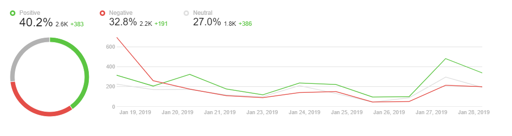
I have to say I expected to see way more negative mentions. 10 days ago, the negative tweets dominated Slack’s mentions, but now the negativity is slowly dying down.
Indeed, not everyone is skeptical about the logo.
Just to give you some reference, here’s Slack’s sentiment compared to other workplace messenger apps, Telegram and Workplace by Facebook. Slack’s share of negative mentions is almost twice as big as that of either of the two competitors.
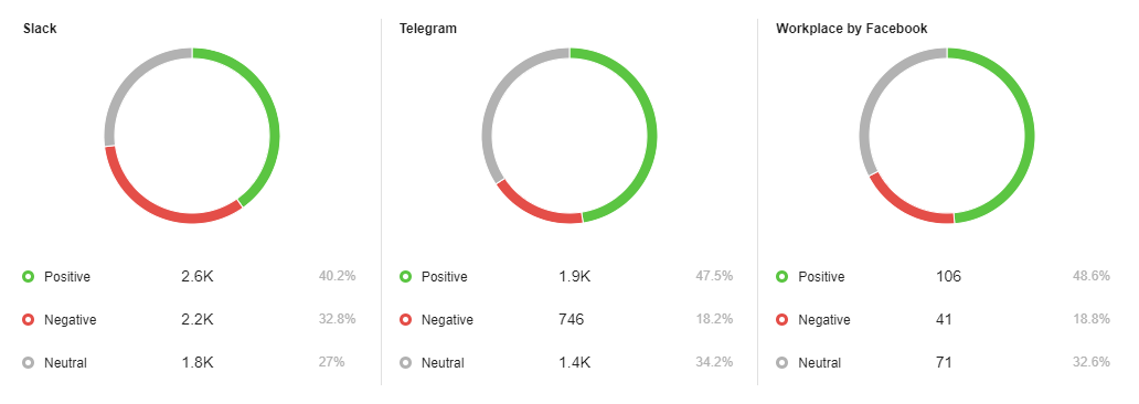
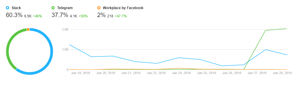
That said, Slack’s share of voice (i.e. their volume of mentions) on Twitter is pretty impressive compared to competitors.
What does Slack say?
With the volume of tweets critical of Slack’s new design, it’s hard - and perhaps unnecessary - for the company to reply to every mention. The few replies they did put together indicate they’re sorry that we don’t like it, but the new logo isn’t going anywhere.
Overall, Slack’s hope is that the logo will grow on us.
And I have to admit, it probably will.
Is it Slack or is it us?
The response to Slack’s logo refresh is by no means unique. Remember how Uber changed its logo a few months back? Everyone hated it.
Back in 2014, AirBnB’s logo redesign caused a similar social media backlash; most of it referencing genitalia, just like with Slack.
In 2015, Spotify’s tiny logo update (they only changed the color to a different kind of green) wasn’t very welcome either.
And those are only a few examples. When Snapchat’s logo got a refresh, its users started a change.org petition to bring the old logo back. It got over a million supporters!
When an app you use daily gets a major revamp, users are seldom happy. But stop to think about it: why do we get so pissed off about something so seemingly small? How important can an icon be?
Apparently, the explanation of our reaction to changes like this has nothing to do with our design preferences. We simply don’t like change, particularly when we don’t have a say in that change, particularly when it comes to companies we admire. The logo is the symbol of a brand’s identity, and when it changes, we often expect the brand itself to change as well.
According to this study, the more we identify with a brand, the more negatively we will react should its logo change. In the study, 632 college students were asked to respond to professional logo redesigns for Adidas and New Balance. Students who expressed weak ties to the brands tended to like the update, but those who identified with the brands strongly reacted negatively to the redesigns.
According to the researchers,
With that in mind, the social media’s reaction to Slack’s redesign may mean the opposite of what it seems… It may mean that people actually feel a strong connection with Slack.
What are your thoughts? Is Slack’s new logo really bad, or is it just a phase most brands go through when they refresh their branding? Let me know in the comments!