New in Awario: Understand why your mentions are growing with Insights

If you're no stranger to social listening, you know first-hand how hard it can be to understand why the volume of mentions around your brand (or a competitor, or whatever else you're monitoring) suddenly increases. Oftentimes, you'll have to spend hours manually digging through hundreds or thousands of mentions to try and figure out what caused the spike. Insights, just out in Awario, are designed to change that.
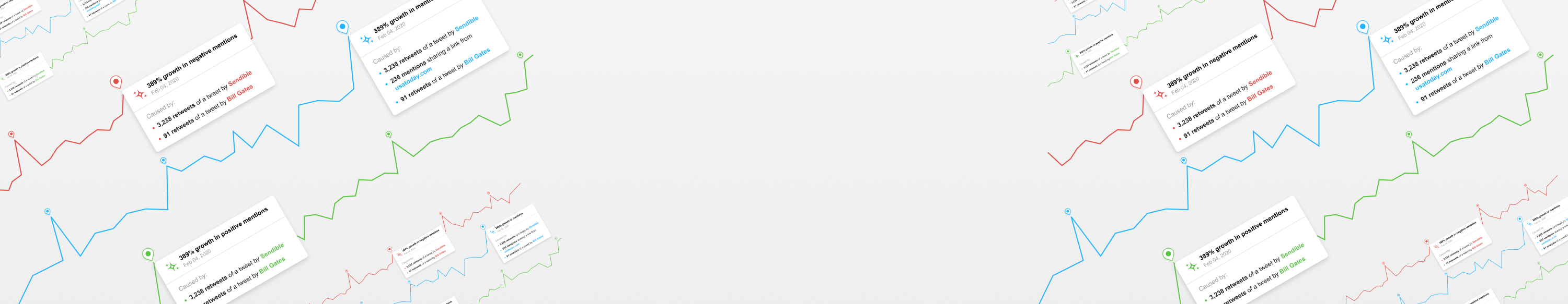
Starting today, Awario will do its best to automate the tedious part of the work - going through all the mentions and looking for trends and anomalies - for you, and give you a list of explanations for spikes in your data: total volume of mentions, positive/negative conversations, and reach.
What exactly are Insights?
Insights are Awario's hypotheses on why there's been an substantial increase in your data. To formulate these hypotheses, we look at your mentions for a given day, week, or month to see if anything noteworthy happened during that period. For instance, somebody's tweet may have been retweeted hundreds of times; a link to a viral article may have been shared extensively on social media; a hashtag or a topic may have dominated the conversation on that day; or an influential social media account or news website may have mentioned your brand.
By signing up I agree to the Terms of Use and Privacy Policy
Where do I find Insights and how do I use them?
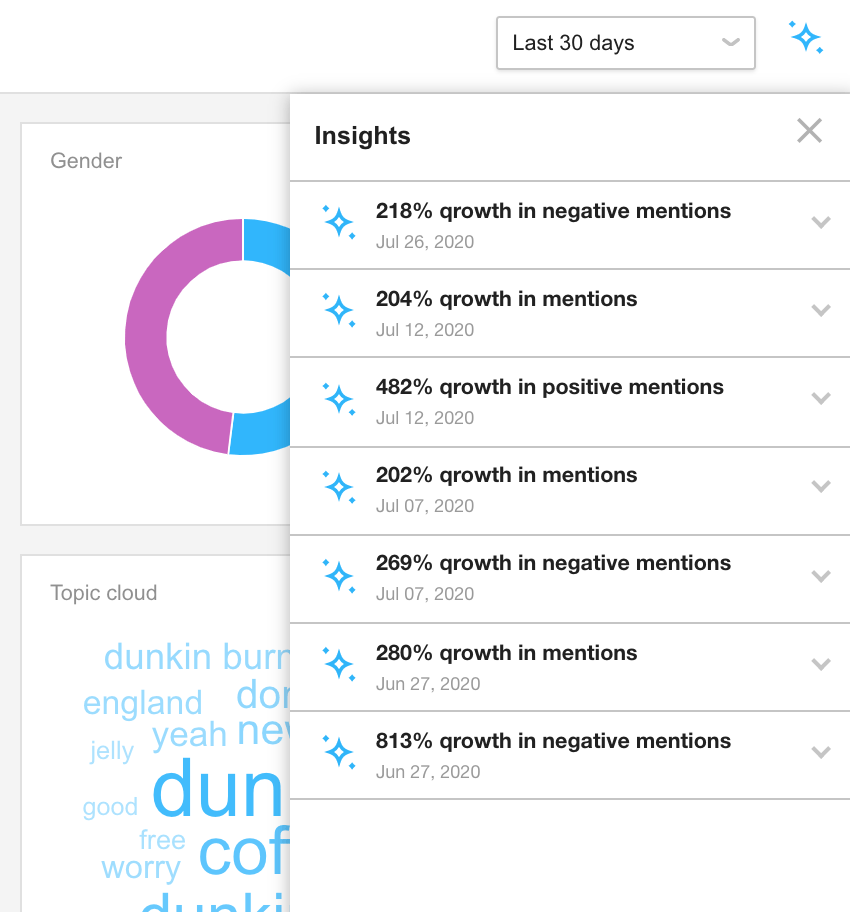
Insights are available to all Awario users (including the free trial). Go to the Dashboard in your Awario account and look at your Mentions, Reach, and Sentiment charts: if Awario detected a spike in the data and was able to come up with a hypothesis, you'll see a pin icon above the spike. From here, you can click on the icon to see up to 3 explanations on why the spike occurred.
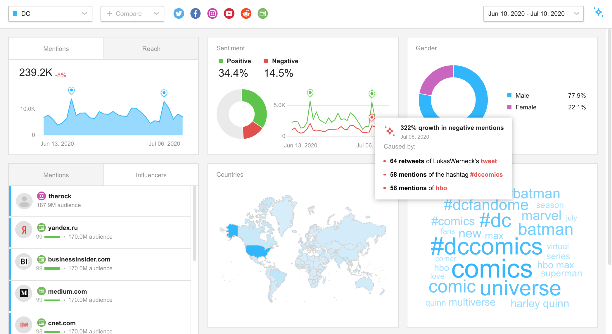
Each explanation is also clickable - it will take you to a filtered version of your feed, showing the mentions that contributed to the spike.
Alternatively, you can hit the Insights icon to the right of the date filter in the top right corner of the Dashboard to display all Insights within the selected date range.
Insights in action: a few examples
Now that we're clear on what Insights are and where you can find them, let's explore some examples to see what they look like on real data sets.
Exhibit A: Tesla's stock goes up, and so do positive mentions
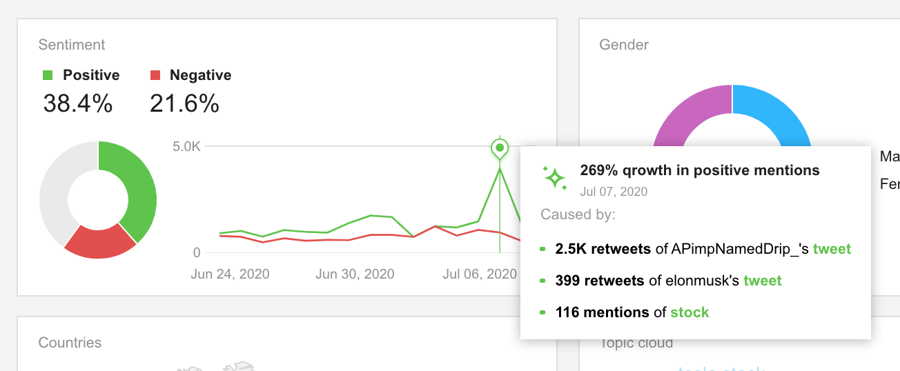
Following a surge in Tesla's stock price at the beginning of July, the company's stock holders started celebrating all around social media, spreading the word about the company that - let's be honest - barely needs it.
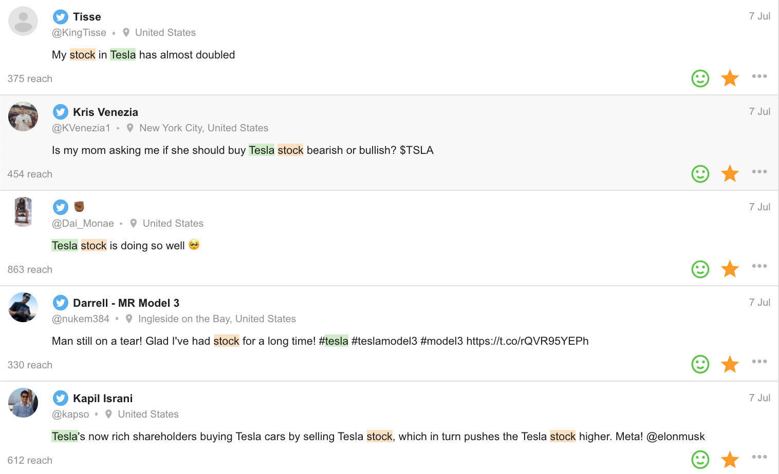
Exhibit B: Burger King's sustainability move isn't met well
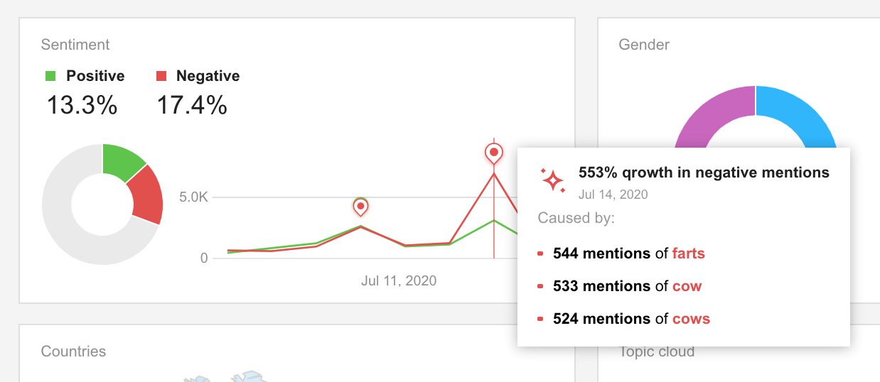
For whatever reason, Burger King decided to jump on the sustainability train. The company announced it would start adding lemongrass to its cows' diet to reduce methane emissions (aka cow farts), which are one of the key contributors to climate change. The Internet didn't take the initiative well.
Hey Burger King -- those of us who eat your food don't give a rat's behind about cow farts. Don't get too #Woke or you'll lose us all. Seriously. Dumbest thing I've read in a LONG time. @BurgerKinghttps://t.co/RlPQBwQsrk
— Joe Pags Pagliarulo (@JoeTalkShow) July 14, 2020
You know what else cuts methane emissions? Taking cows off the menu.
— Nicole Aniston (@XNicoleAnistonX) July 14, 2020
Burger King just reminded people that they’re eating something that farts.
Exhibit C: Airbus gets backlash after announcing job cuts
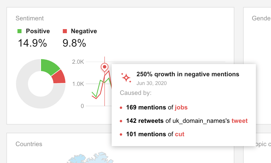
The news of Airbus cutting over 15,000 jobs worldwide contributed to a spike in negative mentions of the brand on June 30th - a rare occasion when negative mentions of the company outnumbered positive ones.
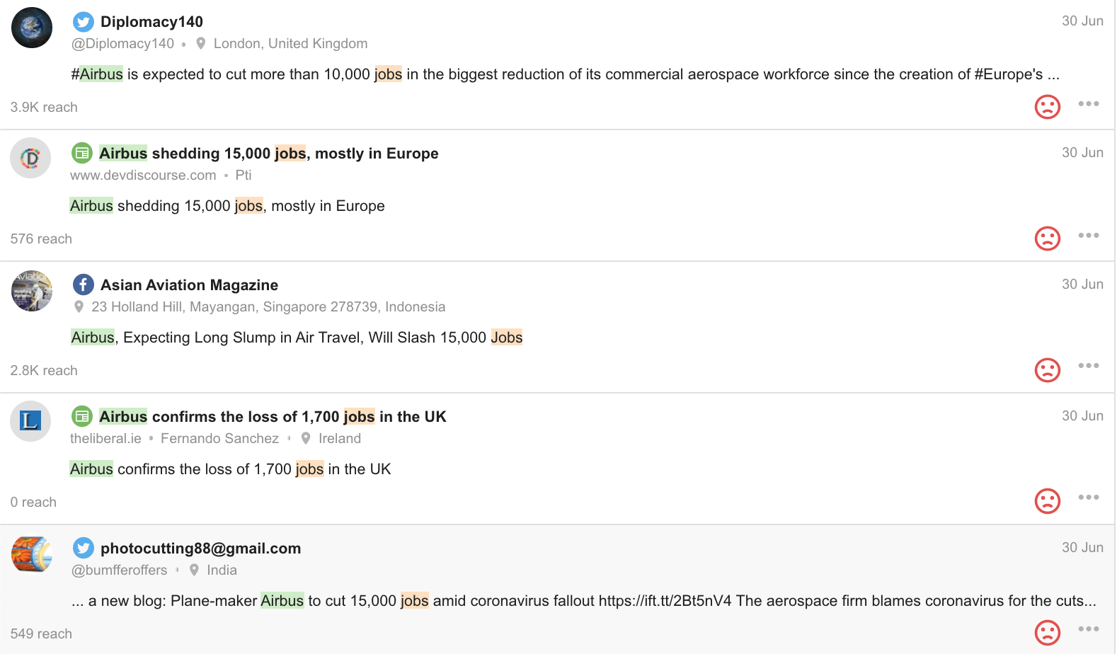
Exhibit D: Starbucks gets celebrated for a bold move
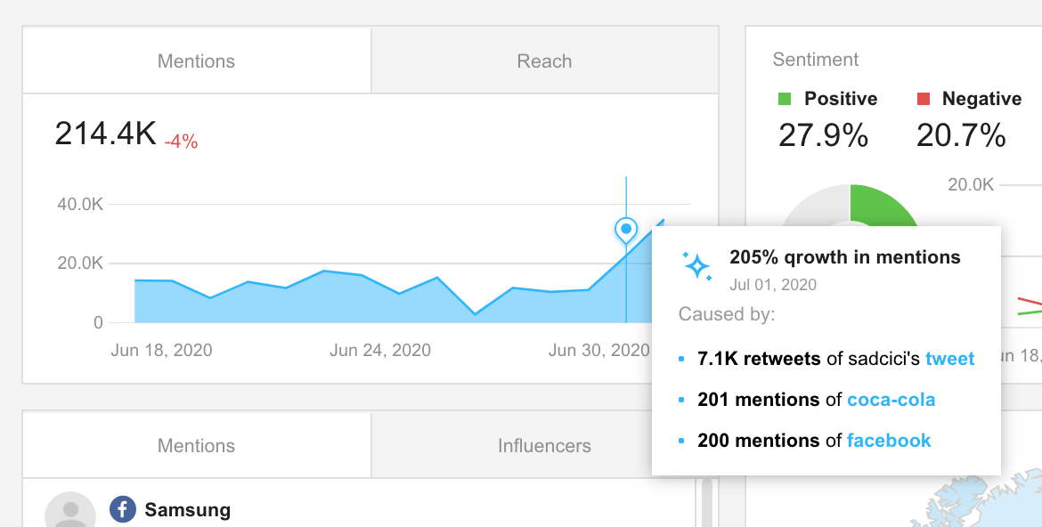
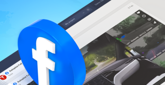
Starbucks is one of those companies that are known for their bold moves. This time, the brand - along with other giants like Coca-Cola, Microsoft, and Target - has seen an increase in the volume of conversations both on social media and around the web, as news spread about the company pulling ads from Facebook as part of the #StopHateforProfit campaign. The purpose of the campaign is to pressure the social network into changing how it handles hate speech and misinformation.
By signing up I agree to the Terms of Use and Privacy Policy
Advertisements for more than 400 brands including Coca-Cola and Starbucks are due to vanish from Facebook on Wednesday, after the failure of last-ditch talks to stop a boycott over hate speech on the site https://t.co/xpCvkwvJUY pic.twitter.com/KUAVOX3zig
— Reuters (@Reuters) July 1, 2020
Facebook cares. Starbucks spends $95 million a year. Diageo $23 million. Best Buy $20 million. Coke $22 million. Hershey's $36 million. Ford $20 million, Aviva $30 million etc. 20 million here, 30 million there... pretty soon you're talking about real money. :-)
— Bill Hibbler ? (@BillHibbler) July 1, 2020
These were just some examples of how Insights may help you identify trends within your data. Insights are a work in progress, and we'd love to hear your feedback. Let us know in the comments below how you're finding them so far, and share suggestions on what we should build next!