Dashboard overview
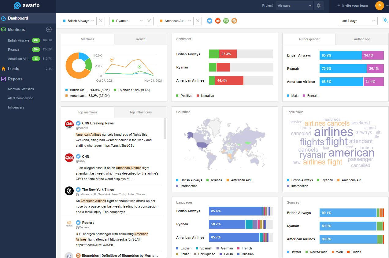
The Dashboard displays analytics for your alerts, mentions, and influencers. Updated in real-time, it's fully interactive, which allows you to see the mentions behind the stats. The Dashboard consists of the Filters toolbar and the Widgets area.
Filters
There are different ways to filter your data in order to get the most relevant results.
First, if you click on the alert name in the Filters panel, you will find a drop-down with all the alerts you have in the project. You can switch between different alerts.
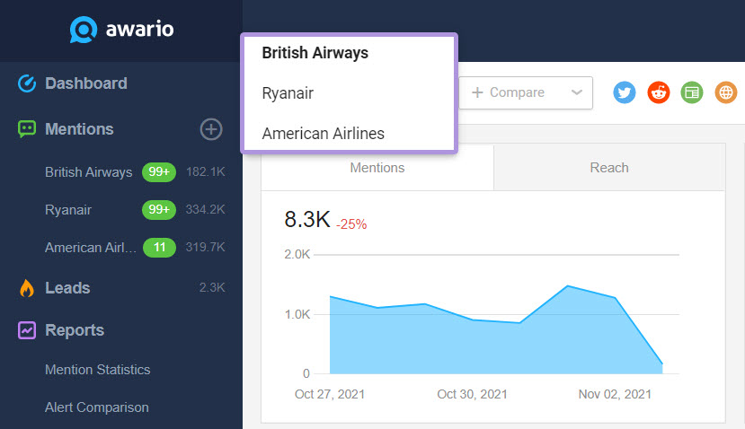
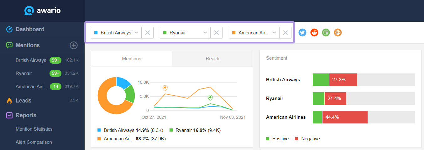
You can also add multiple alerts to the same dashboard. Just click + Compare and select the alerts you'd like to benchmark against each other.
Next are the Source buttons. You can toggle them to hide or add social networks your mentions come from.
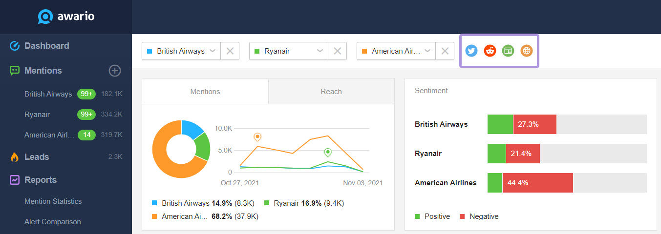
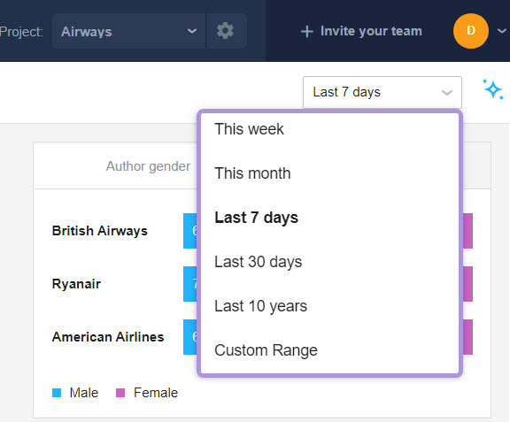
The last one is the Date range filter, which offers a few options for displaying stats as well as the Custom range filter.
Widgets
Awario uses widgets to display mention statistics corresponding to the parameters you set in the filters. The cool thing here is that when a single alert is selected, the widgets become interactive, i.e. clickable, with corresponding filters applied. The New mentions and the Top influencers widgets are always interactive and do not depend on the number of alerts.
The Mentions widget reflects the volume of mentions in the selected alerts. There’s also a timeline for you to see the specific dates when your keywords were mentioned the most.

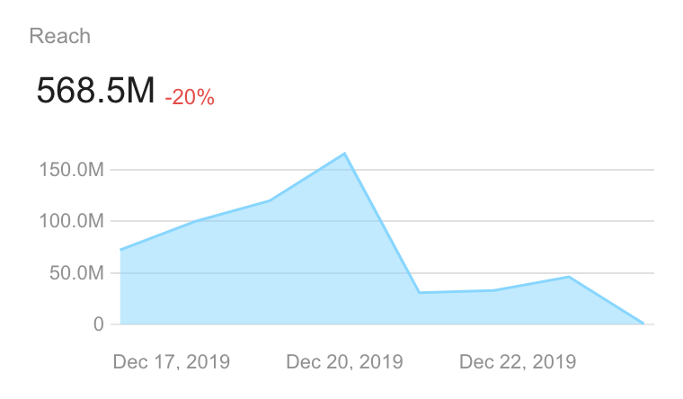
On the Reach widget, you can see the estimated number of people exposed to the mentions. The reach metric is calculated based on a few metrics, depending on the platform:
- Twitter — The follower count of the post author combined with the number of likes, comments, and retweets.
- YouTube — The subscriber count of the author, combined with video view count, like count, comment count.
- Reddit — The karma count of the post author, combined with the number of upvotes.
- News, Blogs, and Web — An estimated figure of daily website traffic.
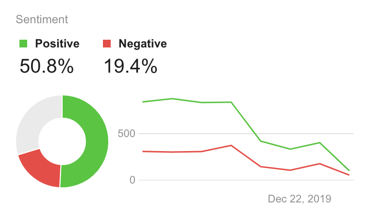
Next is the Sentiment widget comprised of a pie chart and a graph. It reflects the sentiment behind the mentions which can be positive, negative, or neutral. Keeping tabs on the Sentiment graph is a convenient way to track the attitude of your audience to your brand or product.
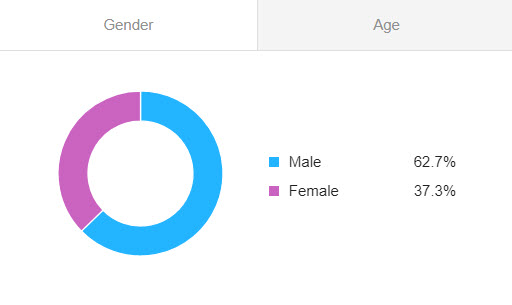
On the Gender widget, you will see the gender breakdown of the authors who mentioned your keywords. We built our own algorithm to classify the gender of the collected results. This classification works for mentions from Twitter and YouTube.
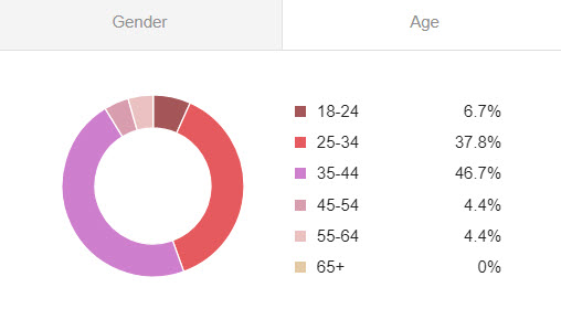
Similarly, we've built the Age widget. It will show how the authors are distributed across predefined age brackets, in percent. This classification works for mentions from Twitter and YouTube, as long as their authors have a proper avatar chosen.
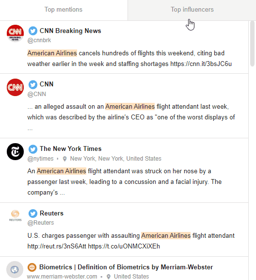
Mentions and influencers are located in the corresponding widget.
Next is the map. The more saturated a country's shade of blue, the more mentions come from there. The countries colored in white are those which didn’t provide any mentions at all.

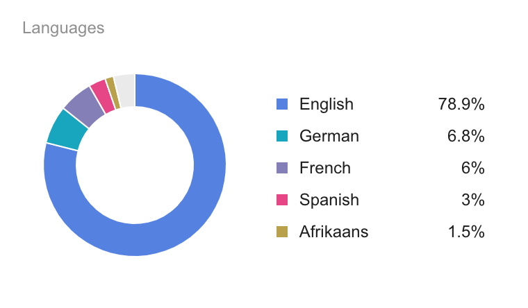
The Languages widget provides stats on the languages used in your mentions most frequently. There’s a pie chart with the most popular language represented by a more saturated blue.
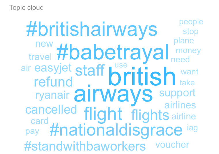
The Topic cloud widget displays the most frequently used words, phrases, and hashtags.
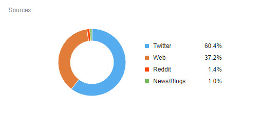
The Sources widget gives you a breakdown of the platforms your keywords are mentioned most often on.