Report overview
The Reports section provides detailed statistics on each of your mention alerts. It helps you understand how effective your strategy has been and also showcases the progress of your work, which you can share with your clients and colleagues. For now, Awario offers three types of reports: Mentions Statistics, Alert Comparison, and Influencers.
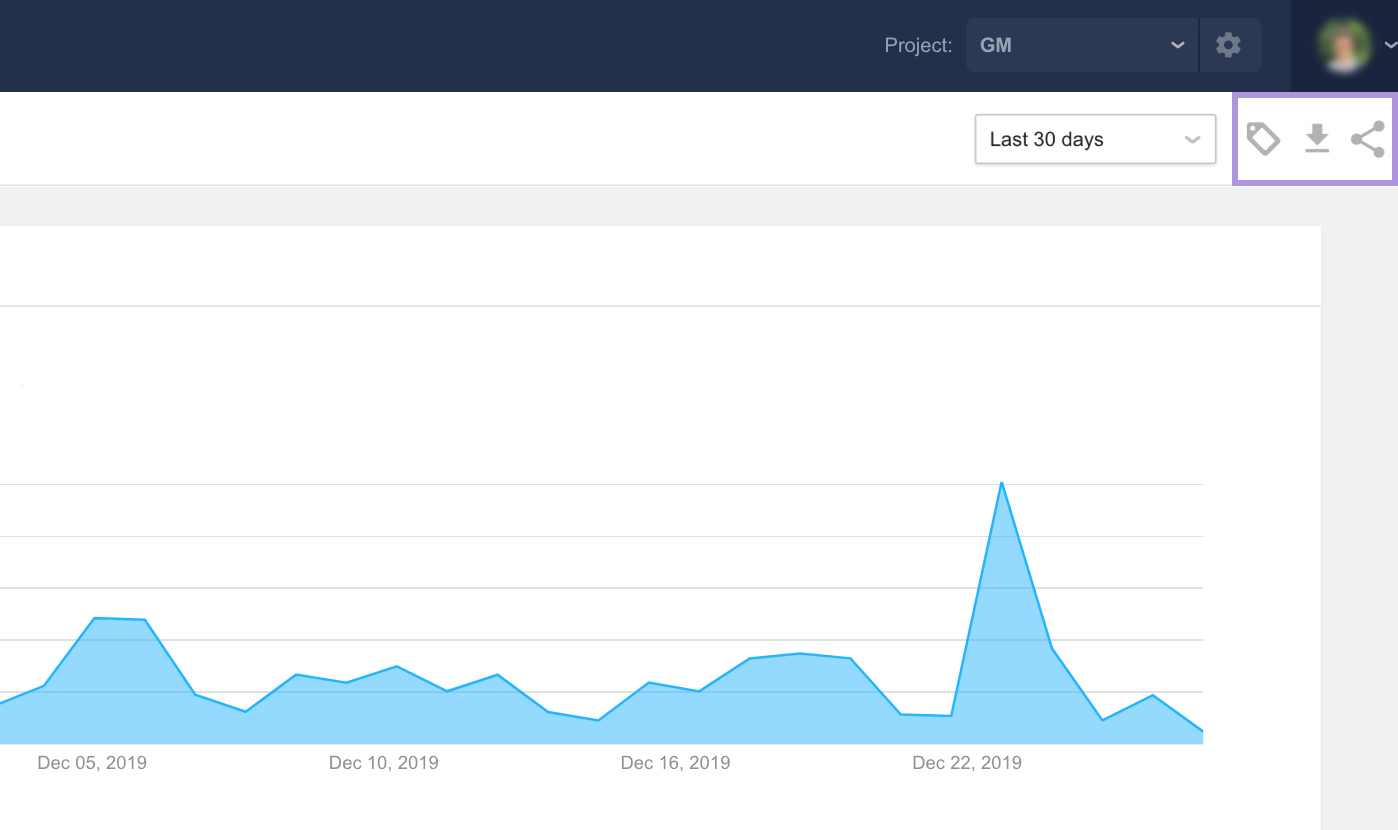
All reports share several filters.
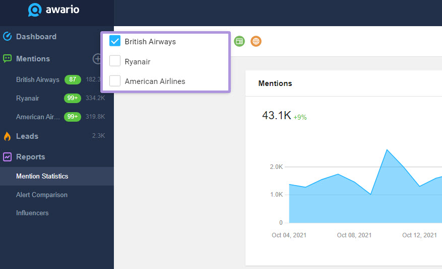
Alert — choose what alerts you'd like to see stats for.
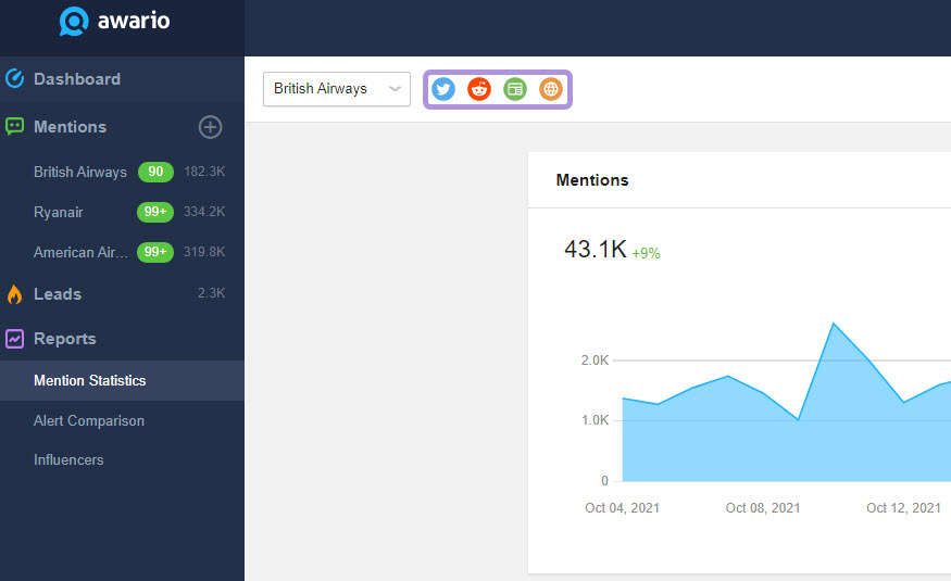
Source — select the sources to be displayed in the statistics.
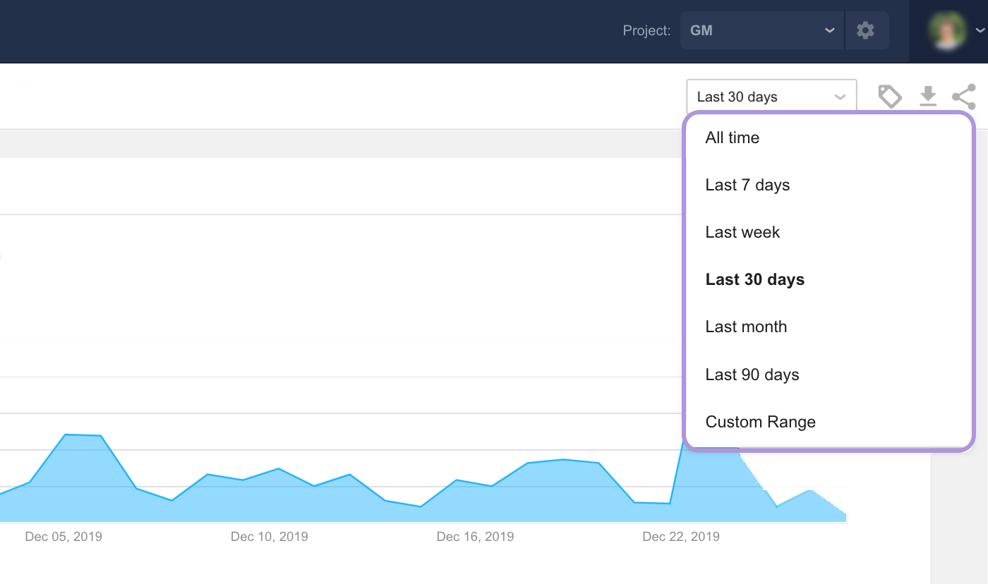
Time Range — set the time range you want to see data for.
Sharing options — apply white-label settings to your reports, or download them as PDF.
Now let's take a look at each report in more detail.
Mention Statistics
This report presents a summary of data on the alert's mentions and has the following widgets:
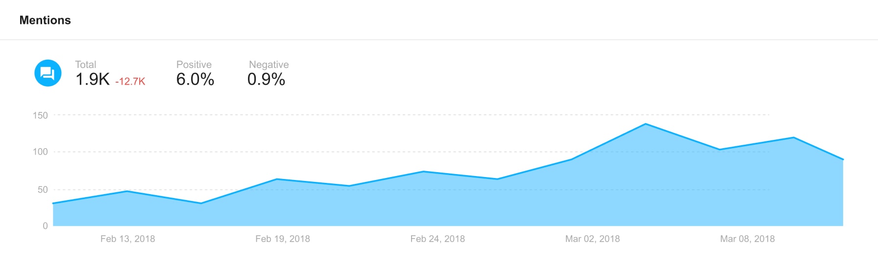
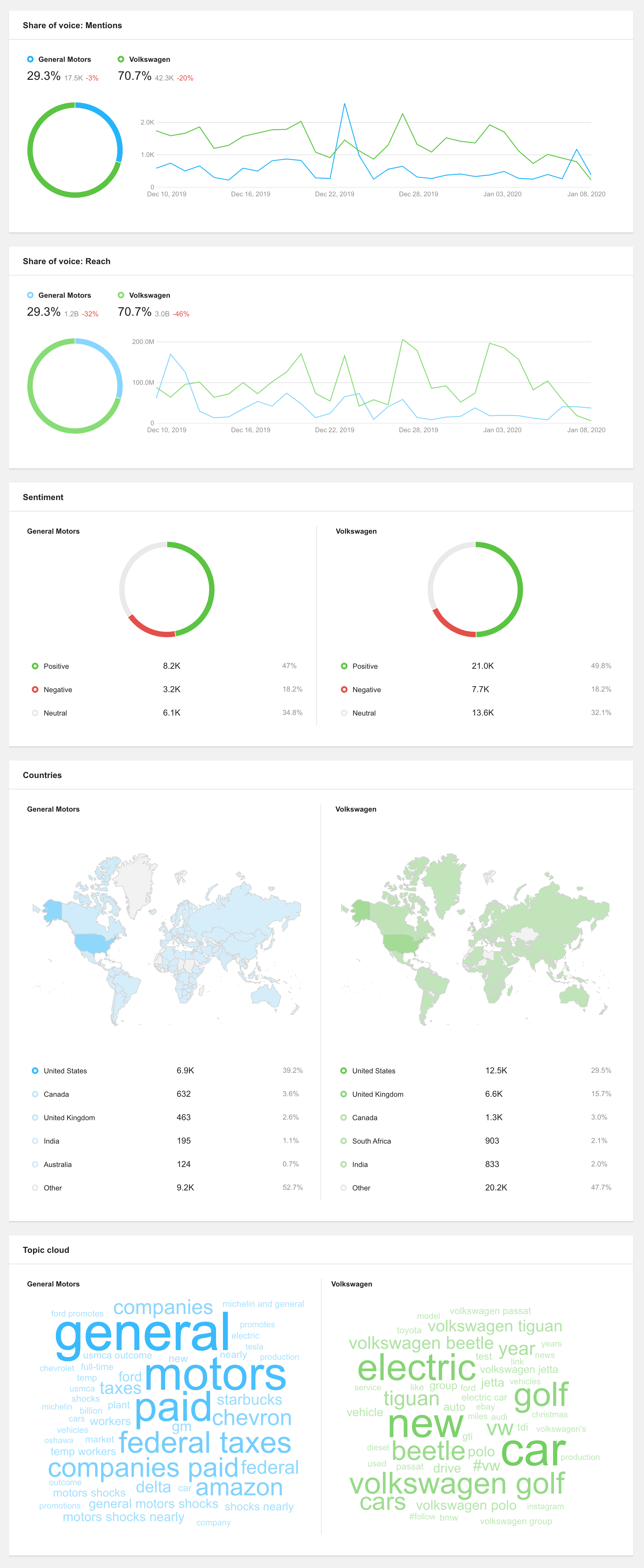
Mentions — the total number of mentions, the difference in the number of mentions compared to the same time range in the past (e.g., compared to the past 30 days, while looking at the most recent 30 days), the shares of positive and negative mentions, and mentions history graph.
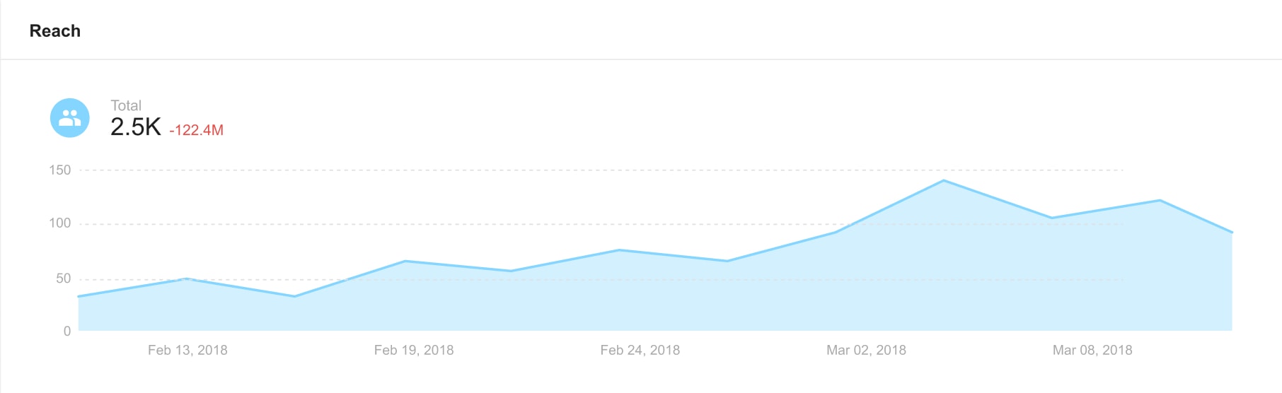
Reach — the total reach, the difference in the number of mentions compared to the same time range in the past, and reach history graph.
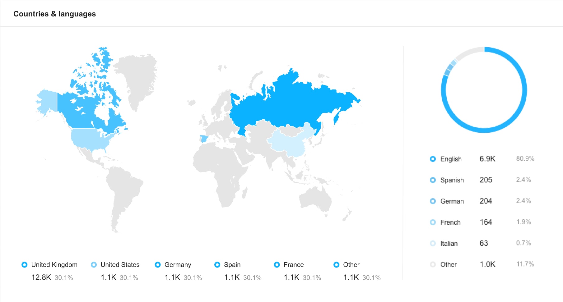
Countries & Languages — a world map with the number of mentions coming from each country, along with the top 5 languages mentions appeared in.
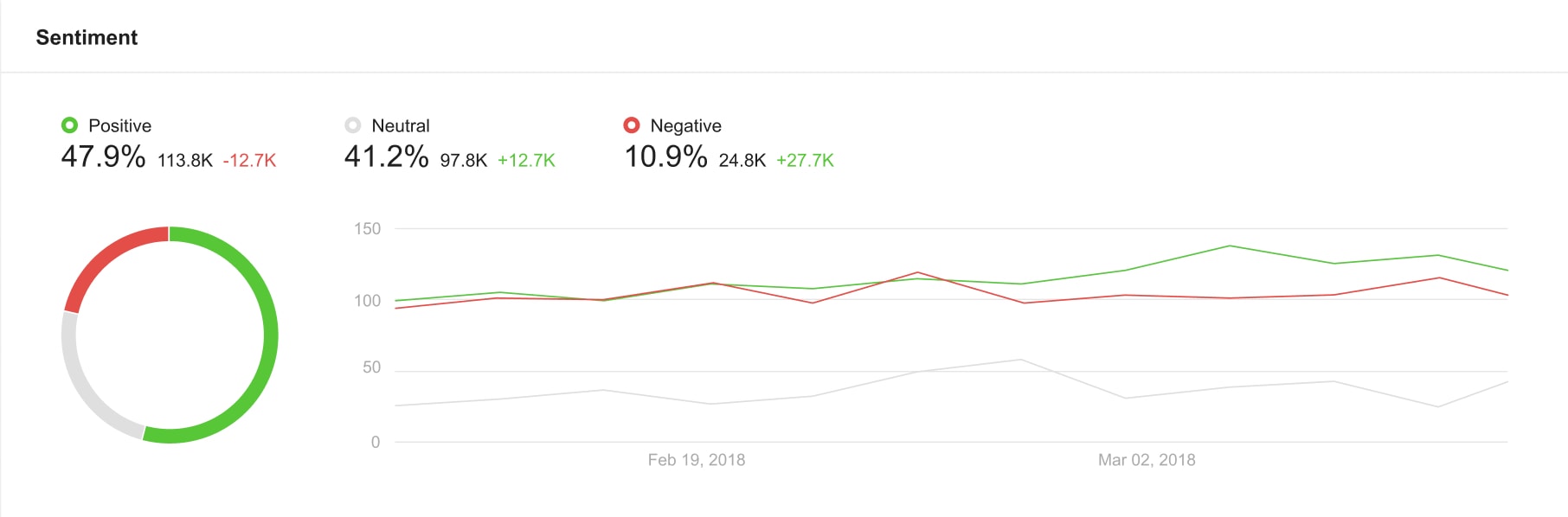
Sentiment — the shares of positive, neutral, and negative mentions, the difference in the number of mentions compared to the same time range in the past, and a graph.
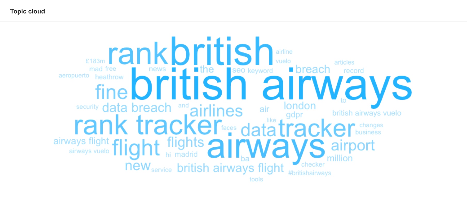
Topic cloud — the most used words, phrases, and hashtags within your results.
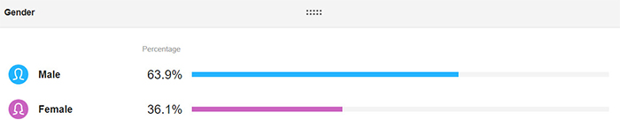
Gender — gender breakdown of the authors who mentioned your keywords.
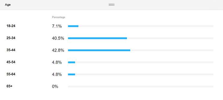
Age — distribution of the authors who mentioned your keywords across predefined age brackets.
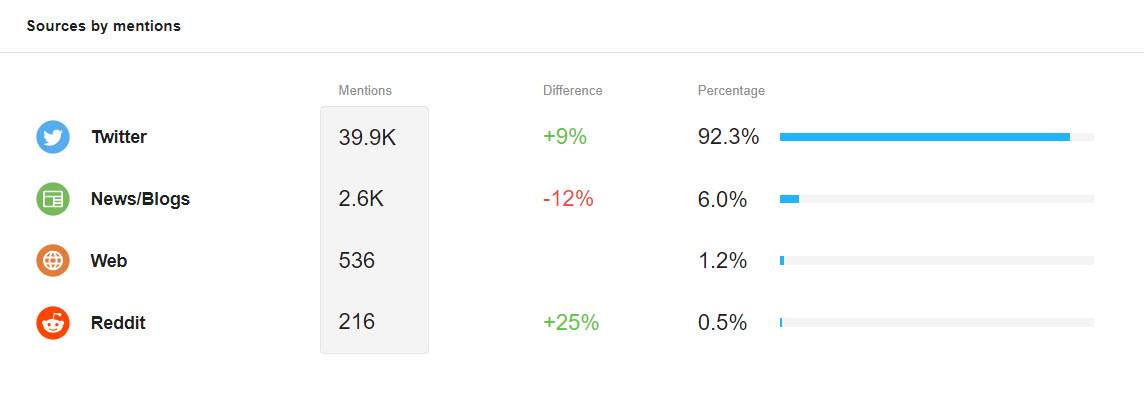
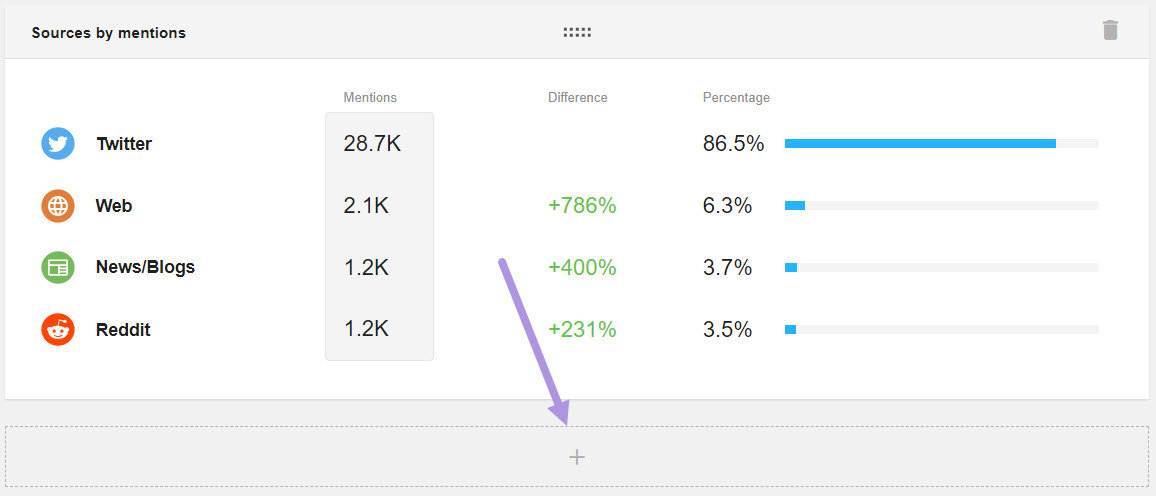
Sources by mentions — the number of mentions, the difference in the number of mentions compared to the same time range in the past, and a percentage for each source.
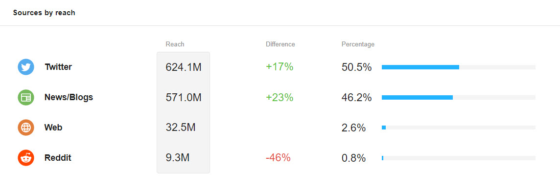
Sources by reach — reach, the difference in the number of mentions compared to the same time range in the past, and a percentage for each source.
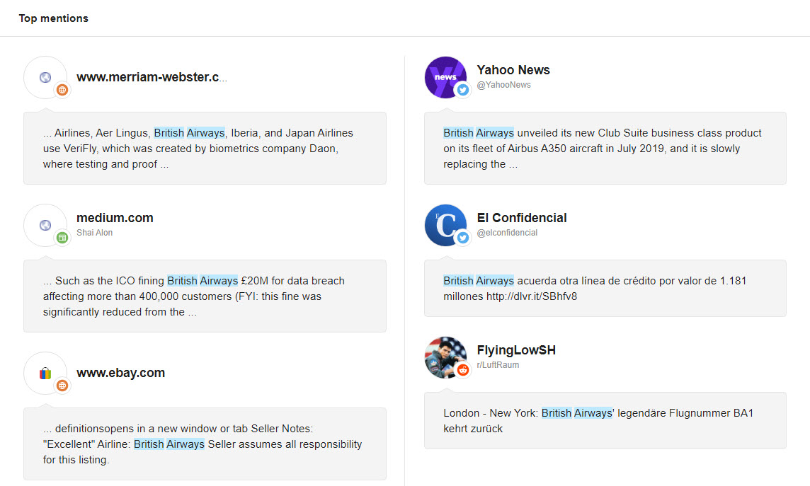
Top mentions — the most influential posts based on reach. Clicking on a mention in this list will open it in a new tab, which lets you start interacting with the post or read its full text.
Add new widgets to make it truly custom — widgets for each metric so that all your data can be easily visualized. Just hit the ‘+’ at the bottom of the reports page to add more widgets to your report.
Our customizable widgets feature allows you to choose bar and line graphs on important metrics for each platform. This includes: Most active, i.e. users who have posted your keyword/s the most times, and Influencers, i.e. users who have posted your keyword/s, sorted by their collective reach.
Alert Comparison
This report presents a comparison of the summarized data for the selected alerts. You can select up to 15 alerts for comparison. Alerts from other projects can also be included in this report.
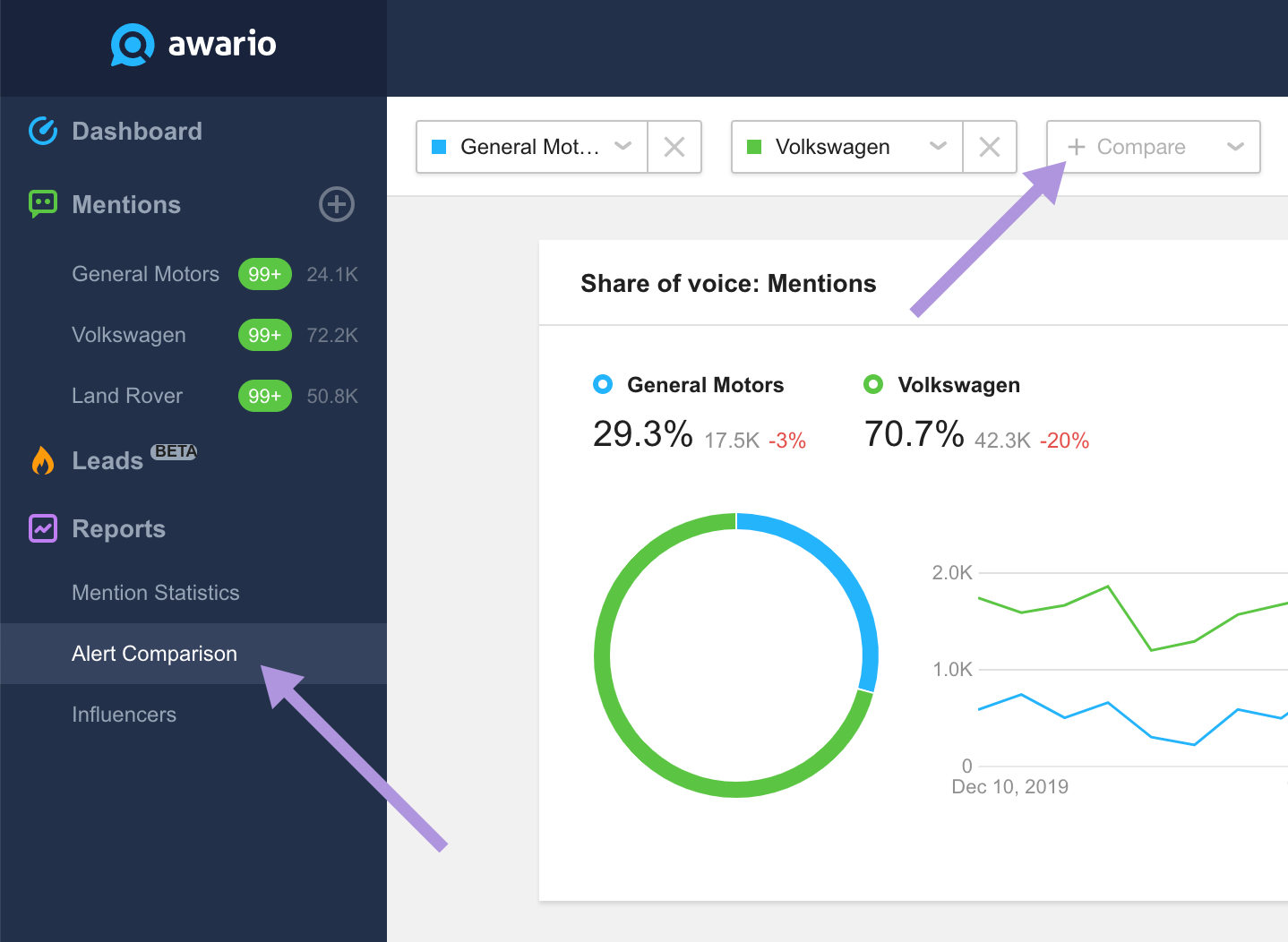
The Alert Comparison report contains all the same widgets as the Mentions Statistics reports but can be used to compare several alerts at the same time.
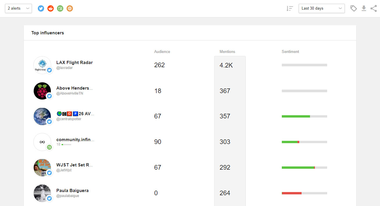
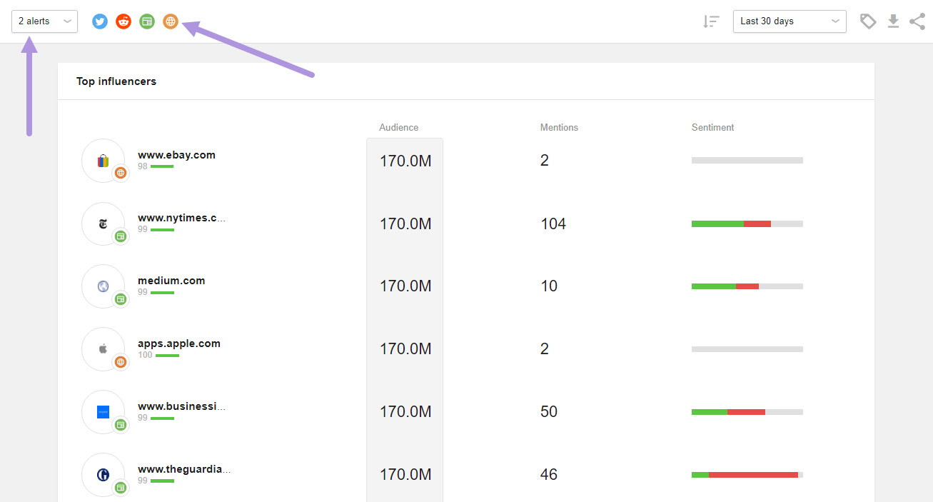
Influencers
In the Influencers report, you’ll initially see a list of social media accounts that mentioned your keywords, listed by their respective audience counts. You also have the option to include results from multiple alerts as well as choose which sources you’d like to see influencers from. Choose from any of the icons to add or remove results from your Influencers report.
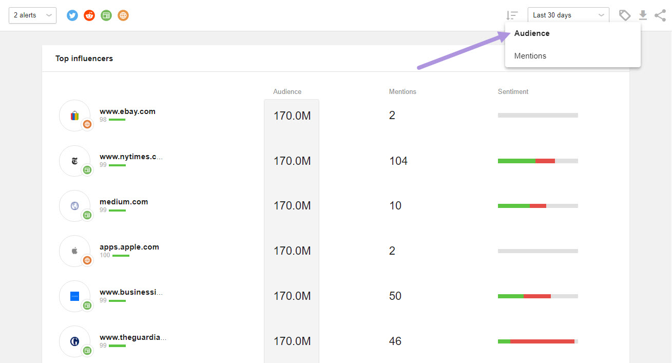
Last, you can choose to sort influencers by their audience counts or the number of mentions of your keywords.
The Influencers report contains the list of authors, their audience counts, the number of mentions coming from them, and sentiment statistics.